LAFFY SMASH
An e-sports team called LaffySmash: a clever fusion of Lafayette and the popular Nintendo game Super Smash Bros. Their original branding lacked inspiration, differentiation, and—most concerning—posed potential copyright issues. They had incorporated elements from the parish’s flag into the “Smash Ball” icon, raising red flags for intellectual property concerns.
I saw the potential in their concept but knew it needed a fresh approach to truly stand out while avoiding legal complications. So, I decided to take matters into my own hands. Even though the team hadn’t reached out to me, I reimagined their branding as a personal challenge.
I wanted to create something that not only honored their passion but also positioned them to grow as a serious contender in the e-sports industry. The result? A logo and brand identity they loved so much, they offered to buy the rights to it—something I initially created to build my portfolio. I accepted their offer, developed a full brand style guide, and in the process, built a strong professional relationship.
-
“I would like to give a MASSIVE SHOUT OUT to Clinton Sonnier for his work on our new logo! He was very patient and one of the most professional people I have ever had the pleasure of working with. The LaffySmash Team and I went back and fourth a lot when trying to come up with the final design for our new logo, but Clinton listened to all of our feedback and worked directly with us for weeks until we came up with something that we all envisioned would be best. I am IN LOVE with the final result!” - R. “Curlz” Varnell
*the original logo

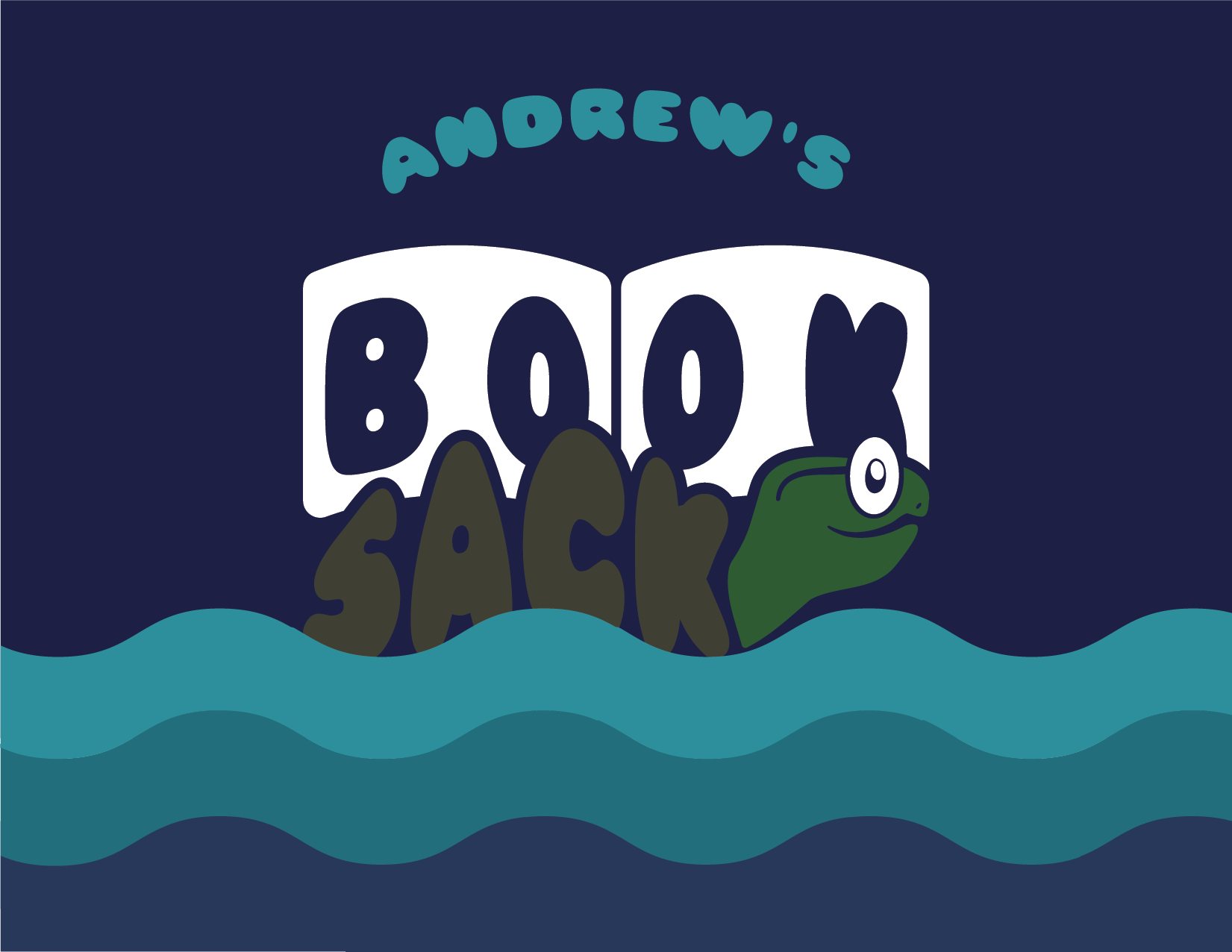
ANDREW’S BOOK SACK
A locally renowned book shop in Slidell, LA underwent a transfer of ownership in early 2024. Andrew, the new owner wanted a cute and family friendly brand identity that also spoke to the local bayou culture.
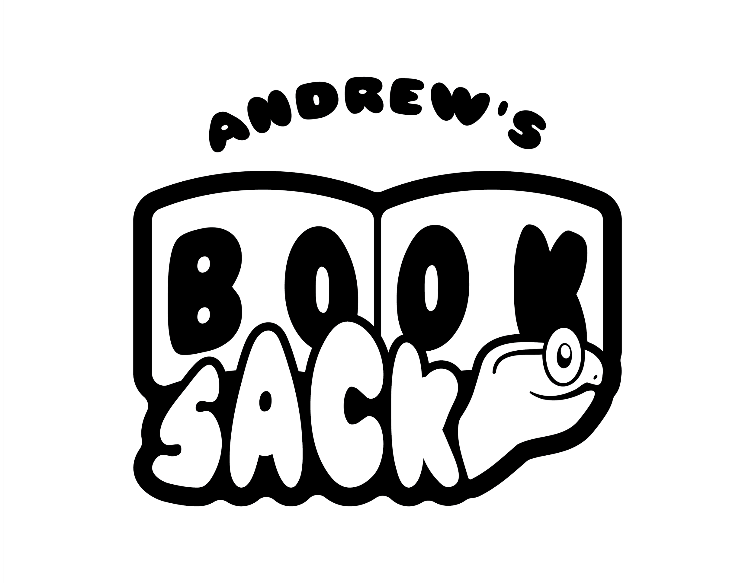
The solution reached was a mascot logo featuring a prominent member of the bayou/swamp scene: the turtle.
*Originally it’s shell was going to be a book.

PROGRESSIVE BAPTIST CHURCH
An opportunity that was presented to me during my time at Absolutely! Embroidery & More. My client, Pastor Chad, came into the business with hopes of rebranding his church. His main criteria was something clean and sleek that can fit with today’s modern aesthetic.
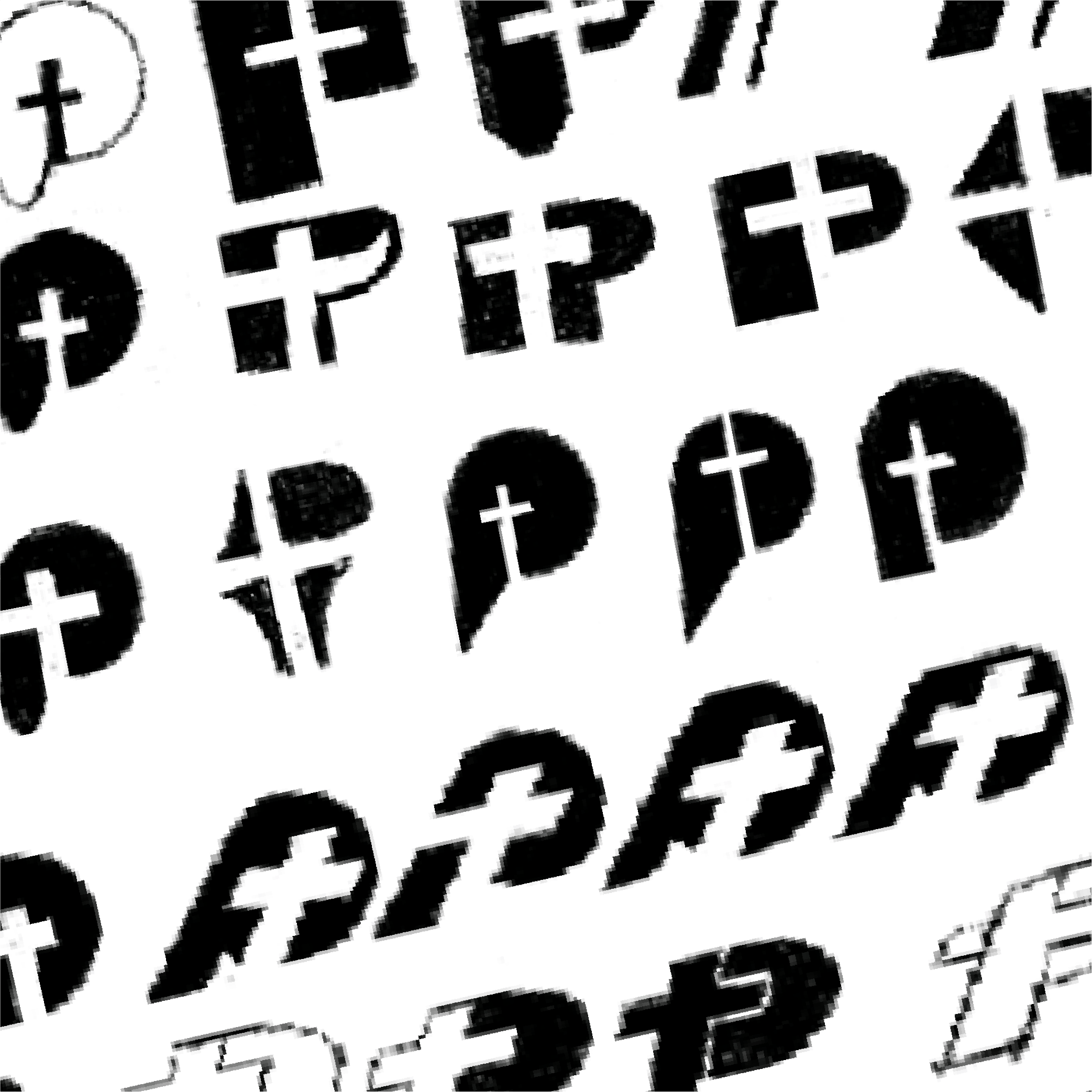
The logomark featuring the P character with a cross embedded into the negative space, creating a simple but effective vision of what the church represents: faith in oneself and in the lord.


